How Adaptive Website Development Techniques Help Websites Perform Better

There was a time when simply having a website was enough. Today, visitors expect pages to load almost instantly, navigation to feel effortless, and content to work just as well on a phone as it does on a desktop. If a website feels slow or clunky, people rarely stick around to figure out why. They simply leave and move on to another option.
That’s exactly why adaptive website development techniques have become more important than ever. Instead of treating every visitor the same, adaptive development focuses on delivering an experience that matches different devices, network conditions, and user needs. The result is a website that performs better, keeps visitors engaged, and stays ready for future changes without constant rebuilding.
What Are Adaptive Website Development Techniques?
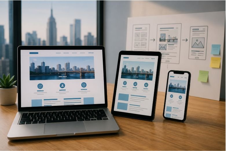
Adaptive website development techniques are strategies that help websites adjust to different user environments rather than relying on a one-size-fits-all experience. These techniques consider factors like screen size, internet speed, browser capabilities, accessibility needs, and device performance to deliver the best possible experience.
While adaptive web design and responsive layouts are often mentioned together, they aren’t identical. Responsive layouts resize content fluidly across screens, while adaptive approaches can serve different layouts, assets, or functionality based on the visitor’s specific environment. Combining both often leads to stronger website performance and a more consistent user experience.
The goal isn’t just to make a website look good. It’s to ensure every interaction feels fast, intuitive, and reliable regardless of how someone accesses it.
Why Website Performance Depends on Adaptability
A high-performing website does much more than load quickly. It responds smoothly, remains accessible, and delivers content efficiently under different conditions.
Faster Loading Across Different Devices
Every visitor arrives with different hardware and internet speeds. A modern laptop connected to fiber internet has very different capabilities than an older smartphone on a slower connection.
Adaptive website development techniques optimize images, reduce unnecessary scripts, and prioritize essential content first. Features like lazy loading, browser caching, and efficient content delivery help reduce page load speed without sacrificing quality. These improvements also contribute to stronger Core Web Vitals, which measure how users actually experience website performance.
Better User Experience and Engagement
Visitors notice smooth experiences even if they don’t recognize the technology behind them.
When navigation feels natural, buttons respond quickly, and pages remain visually stable during loading, users spend more time exploring. Better user experience often leads to lower bounce rates, longer sessions, and improved audience engagement because people aren’t distracted by frustrating delays or broken layouts.
Stronger Search Visibility
Search engines increasingly reward websites that provide positive user experiences. Factors like loading performance, mobile usability, structured content, and technical quality all contribute to better visibility.
Although adaptive website development techniques don’t guarantee higher rankings, they create the technical foundation that helps search engines crawl, understand, and evaluate website quality more effectively.
Adaptive Techniques That Make the Biggest Difference

Not every optimization requires rebuilding an entire website. Small improvements often produce noticeable performance gains.
- Use flexible layouts that adapt naturally across screen sizes while maintaining readability.
- Optimize images with modern formats and responsive sizing to reduce unnecessary downloads.
- Implement lazy loading so media appears only when visitors need it.
- Split large JavaScript files into smaller pieces to improve perceived performance.
- Apply progressive enhancement so essential content remains available even if advanced features aren’t supported.
- Monitor Core Web Vitals regularly to identify performance bottlenecks before they affect visitors.
Each of these techniques contributes to faster browsing, smoother interactions, and better website scalability over time.
Common Mistakes That Limit Website Performance
Many websites struggle because they prioritize appearance over functionality.
Large uncompressed images, excessive animations, unnecessary plugins, and heavy JavaScript libraries can slow pages significantly. Ignoring mobile behavior is another common mistake, especially as mobile traffic continues to account for a large share of website visits.
Another overlooked issue is assuming every visitor has the same connection speed or device capabilities. Adaptive web development recognizes these differences and delivers resources more intelligently instead of sending identical assets to everyone.
Regular performance testing, image optimization, code reviews, and usability evaluations help identify issues before they impact real users.
Why Adaptive Development Is a Smart Long-Term Investment

Technology changes quickly, but user expectations evolve even faster. A website built with adaptability in mind can accommodate new devices, changing accessibility standards, and evolving performance requirements without requiring a complete redesign every few years.
Modern workflows are also changing how websites are planned and developed. Building websites with AI development tools has become part of that evolution, helping developers generate responsive page structures, accelerate code scaffolding, prototype interfaces, and create initial content much faster than traditional workflows alone.
AI-powered coding assistants can also simplify debugging, recognize coding patterns, and reduce repetitive development work. These efficiencies allow teams to spend more time refining user experience, performance optimization, and overall website quality rather than repeating routine tasks.
The strongest websites still combine automation with thoughtful decision-making. Adaptive strategies ensure that every improvement supports real visitors, not just faster production.
Frequently Asked Questions: How Adaptive Website Development Techniques Help Websites Perform Better
What are adaptive website development techniques?
Adaptive website development techniques are methods that optimize websites for different devices, network conditions, and user needs to improve performance, usability, and accessibility.
How are adaptive websites different from responsive websites?
Responsive websites mainly adjust layouts using flexible grids, while adaptive websites can deliver different layouts, resources, or functionality depending on the visitor’s device or environment. Many modern websites benefit from using both approaches together.
Do adaptive website development techniques improve SEO?
They support SEO by improving page speed, mobile usability, accessibility, Core Web Vitals, and overall user experience, all of which contribute to stronger search performance.
Can small businesses benefit from adaptive development?
Yes. Adaptive techniques help businesses create faster, more accessible, and easier-to-maintain websites without necessarily increasing long-term development costs.
Why Better Performance Starts With Smarter Decisions
Great websites aren’t defined by flashy visuals or endless features. They’re remembered because they feel effortless to use. Adaptive website development techniques encourage developers to think beyond layouts and focus on how real people experience a website under different conditions. Whether someone visits from a high-speed desktop connection or an older mobile device, adaptability helps deliver a consistent experience that builds trust and encourages visitors to stay longer.
As technology continues to evolve, websites that adapt instead of react will be better positioned for long-term success. Investing in flexibility today makes future improvements easier, helping websites remain fast, accessible, and valuable long after they’re launched.